Here we are again starting another year that is sure to be full of surprises. 2023 finished up nicely for the markets but now there’s some profit taking going on to start off this year. That’s understandable given recent performance as markets reset a bit for the year ahead. Investors, at least on average, are always looking forward so let’s spend some time on strategies and tactics for 2024. We’ll jump right in with expectations for bonds and plan to do the same for stocks next week.
I usually role my eyes whenever market strategists make annual predictions, but it’s part of their job and I understand that. Very much like weather reports, some market calls end up being accurate while others can be very wrong, but it’s still instructive to pay attention to them. I like to blend multiple predictions to get a feel for what’s expected instead of betting on one super-specific forecast.
One issue this applies to, yet again this year, is the Fed and what it may do to the interest rate environment as it continues to fight inflation. Here are a few predictions representing the current consensus.
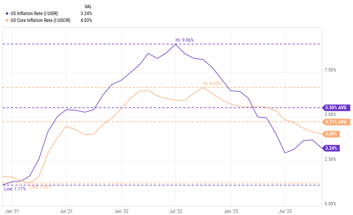
JPMorgan expects/suggests (with at least a 1 in 3 chance of happening…) that the Fed cuts rates this year by 2.5%, bringing the short-term target rate it controls down to about 3%. This should help bond returns while also reducing mortgage rates and the cost of financing in general. One interesting thing about their prediction is that it doesn’t require a recession for the Fed to lower rates like this. Instead, it’s suggested that the Fed has room to do so while still being restrictive enough to bring inflation down from about 3% or so currently to the Fed’s 2% target.
Along these same lines Schwab expects rate reductions of about 0.75% from the Fed as a base case. Schwab’s predictions are usually pretty conservative and this one also doesn’t expect a recession but that economic growth and inflation continue to slow at a measured pace. Should we dip into recession Schwab expects that rate reductions could double to 1.5%. (By the way, Schwab’s base case essentially matches the Fed’s own rate prediction. The Fed was totally wrong in 2022 and it can be argued they mismanaged rates in the first place, but they nailed the 2023 forecast… maybe that accuracy continues in 2024?)
And then there’s the bond market’s own predictions. The CME Fedwatch Tool is a moving target representing where investors in the interest rate futures market are putting their money. For some weeks this tool has been showing market expectations similar to the JPMorgan prediction which is more “dovish” then the Fed expects itself to be this year. Bond investors tend to overshoot reality so checking in on this tool periodically is helpful as expectations evolve.
Other predictions abound but the majority are in this same vein. The obvious throughline is investors expect the Fed to cut rates this year by some amount and that any recession should be mild. A lot of this is already priced into the bond market but declining rates would be a welcome change, sort of a tailwind, for bond investors.
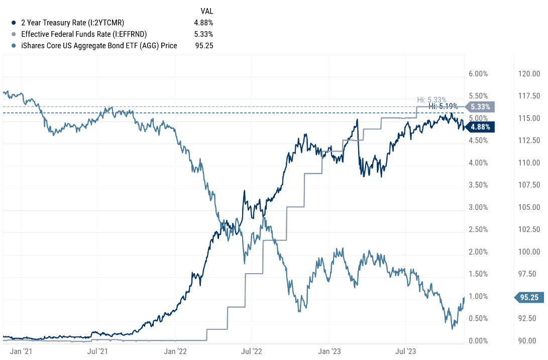
So what to do? Maybe you sold bonds back in 2022 or last year and have cash in a money market fund or bank CD that’s been earning 5+%. Funds like Schwab’s Value Advantage Money Market are still at that level but are tied to the short-term rate environment and often hold investments with maturities of 30 days or less. This means there’s a lag in how these funds respond to rate changes but they do respond. Bank CDs usually have rates that are guaranteed until maturity so mark your calendars for the maturity date if you haven’t already. Otherwise, your bank could roll you over into a lower-paying CD for another term. Currently, 1yr CDs are paying around 4.8% and this could drop to what come Spring or Summer? You want the opportunity to make an informed decision so that’s why you need to pay attention.
Assuming you agree with the general sense of these predictions as I do, it’s probably best to start working cash back into core bonds. You can do so incrementally or all at once, but I tend to favor the slow and steady approach as a way to handle uncertainty. Perhaps let declining money market rates or your maturing CDs be a signal for when to add more to bonds.
You can look at Vanguard Total Bond Market (available as a mutual fund or ETF, but I favor the ETF) or the iShares US Aggregate Bond ETF, or similar funds at Schwab, Fidelity, and so forth. These funds hold Treasurys, government agency and corporate bonds that are considered “investment grade” versus “junk”. The funds buy bonds of various maturities but these average to about medium in terms of interest rate risk and where the bond market is generally.
As a reminder, I’m doing all the above on your behalf if I’m managing your portfolio. Otherwise, and as always, feel free to ask questions.
Here are the links I mentioned.
JPMorgan…
https://am.jpmorgan.com/us/en/asset-management/adv/insights/portfolio
Schwab…
https://www.schwab.com/learn/story/fixed-income-outlook-rocky-road-bond-market
The CME Fedwatch Tool…
https://www.cmegroup.com/markets/interest-rates/cme-fedwatch-tool.html
Have questions? Ask us. We can help.
- Created on .